Don't center align paragraph text
April 10, 2021
This is an experimental post, meant to demonstrate to you the topic we're discussing. I'd love to hear what you think about it. Drop me a line if you find this compelling - I'm hoping to create more like it!
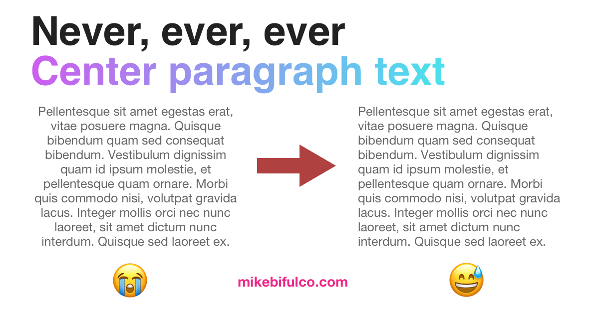
This is -- without exception -- my biggest design-related pet peeve. You've probably come across it yourself from time to time, and if you're lucky, it's not something you noticed. Centering text on a web site, email, or flyer is an easy way to make it appear like a designer's spin has been put on a document. It's an easy change to make in most editors, and in many cases it's probably done without a second thought.
I'll cut to the chase: center-aligning text is really bad in most cases. From a young age, we're trained to read text by starting at the beginning of the line and moving our eyes across the page to the end of the line. From there, it's a relatively low-effort thing to move your eyes back to the beginning of the next line. That all changes when text is centered, since the start of each line is aligned inconsistently. It takes more effort to find the beginning of the next line, to make sure you've only moved down one line, and to continue reading.
Three great reasons you shouldn't center-align text:
- A ragged leading-edge makes it harder to move your eyes to the next line of text
- People with dyslexia may find centered text challenging to read.
- Lists (like this one) become disorienting to read, and harder to scan
The British Dyslexia Association provides a dyslexia-friendly style guide, which calls out a simple rule for text:
As a designer, this is such an easy win. As a developer, it's often as easy as:
/* change this */.some-style-rule {text-align: center;}/* ...to this! */.some-style-rule {text-align: initial;}
When you can use centered-text
Generally speaking, if you're certain that your text will fit on one line, it may be okay to center it. This generally applies to page titles, captions on pictures, and things of that nature. Even then, generally speaking my guidance is to avoid it. Like many other things in design, if there's not a good reason to do it... you're better without.
Summary
If you're working on a design that relies on centered text, consider other options. If you come across a big blob of centered text in your workplace, or out in the world somewhere, please feel free to use this post as a demo.